About the Results
Data Collected
Each test produced a mean (average) number of IOPS performed throughout the test interval, which is just the total input or output operations divided by the seconds of test duration. This result is one sample. For each storage method, I found the mean and the standard deviation1This is technically the standard deviation of the sample. (s) of the IOPS for all 20 samples. This provides a more accurate measure of the performance (the IOPS) and the variance of that performance (the IOPS standard deviation).
Each of the six storage method’s test sets comprised six I/O patterns. Each set was conducted 20 times.
Instead of simply displaying some bar graphs, I wanted to provide a visualization of both the performance and variance for each storage method. The performance is crucial, of course, but the variance describes something about the character of the storage method that a simple mean does not do. Remember, this is the way that whole five-minute-long tests varied, not just merely variance during a test. This is not the typical way to show these kinds of results, so let me spend a few sentences describing how to read the graphs.
How to Read the Graphs
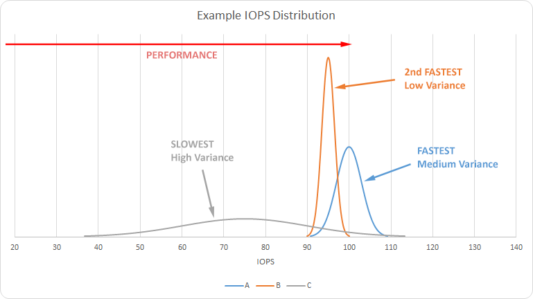
The graph below shows the hypothetical results of an I/O test. Each result is a normal distribution (a “bell curve”), each of equal area, representing the probability of performance at that rate of IOPS. The area under the distribution for A is the same as that of B and C, each summing to 1 (100%). That’s why wider distributions are shorter. A higher distribution does not mean better performance, just less variance in the performance. The distribution with the rightmost peak (A) is the highest performing (on average), whereas the opposite is true for the distribution with the leftmost peak (C).

For the sake of reference, this is the graph of the following data:
| Test | IOPS | s |
|---|---|---|
| A | 100 | 3.0 |
| B | 95 | 1.5 |
| C | 75 | 15.0 |
For better viewability, I have truncated the tails of the distributions at a limit of P=0.0001. I have also clipped the graphs for some results, cutting off the peaks of highly invariant results to display the rest of the results better.